Enter the password provided to continue.
Case Study
IA & Usability Testing
Overview
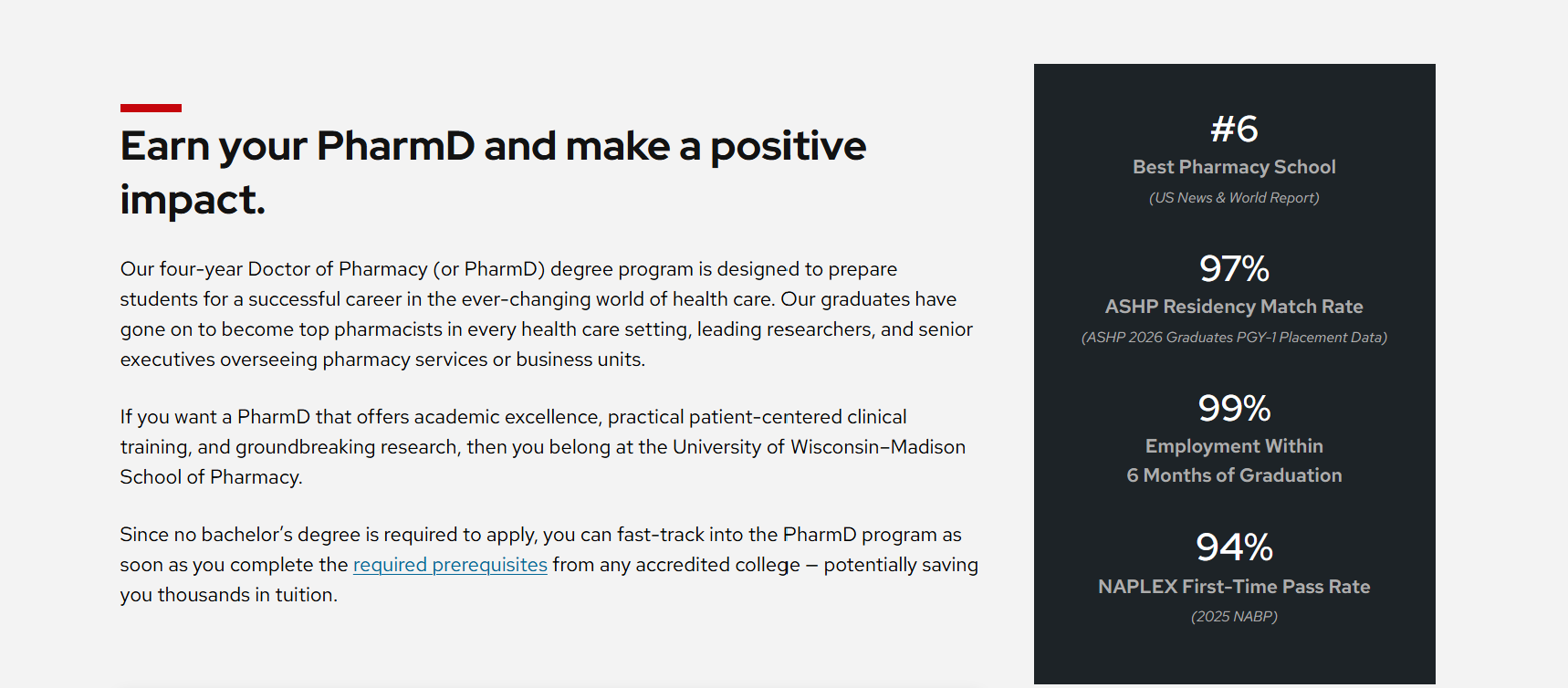
The UW-Madison School of Pharmacy needed a new website — one that would stand apart from competing programs and make a real case for pharmacy as a career path. The site was organized like the department was organized which didn't match how prospective students actually looked for information.
My work covered the full pre-launch research sequence: IA validation through card sorting and tree testing, content recommendations for each page, and usability testing with two user groups before the site launched. The structure had to match the mental models of prospective students, not the internal team's.
My Role
Information Architecture
We started with a question the school needed an outside perspective on: how do prospective students understand their content's organization? We ran remote, qualitative card sorts using Optimal Workshop with a range of participants — from current students to staff — to map out how users expected information to be grouped.
Card sorts surfaced a consistent set of grouping assumptions that didn't always match the school's internal organization. With that data in hand, we built a preliminary site structure and validated it with tree testing, using a large panel of prospective students as the primary test group. Their navigation behavior revealed where our labels were working and where they weren't.
The combined results identified three recurring issues the school needed to address before moving into design:
Content Strategy
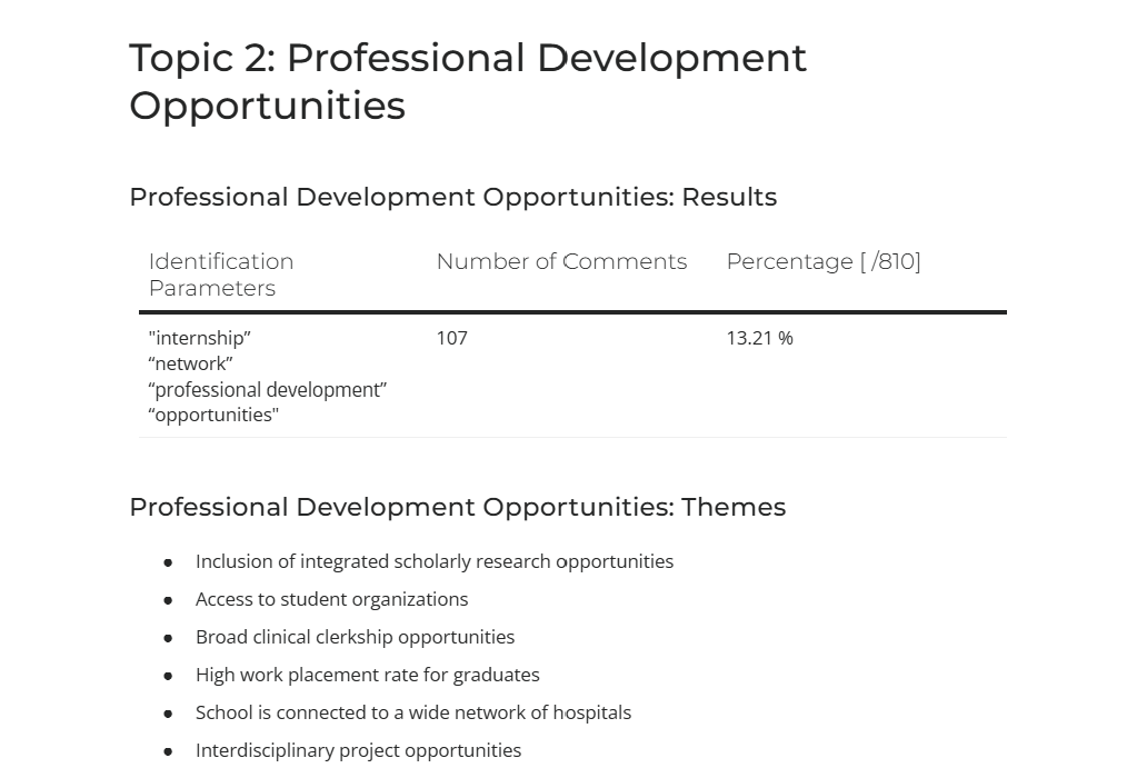
Content strategy wasn't my primary deliverable, but IA and content planning are hard to separate. Once you know what structure users expect, the next question is: what lives there, what should it accomplish, and what tone does it take?
For each proposed page, I developed recommendations covering content goals, required information, and voice. Prospective students evaluating a graduate program are making a major life decision. The content needed to feel honest and direct.
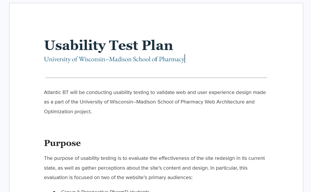
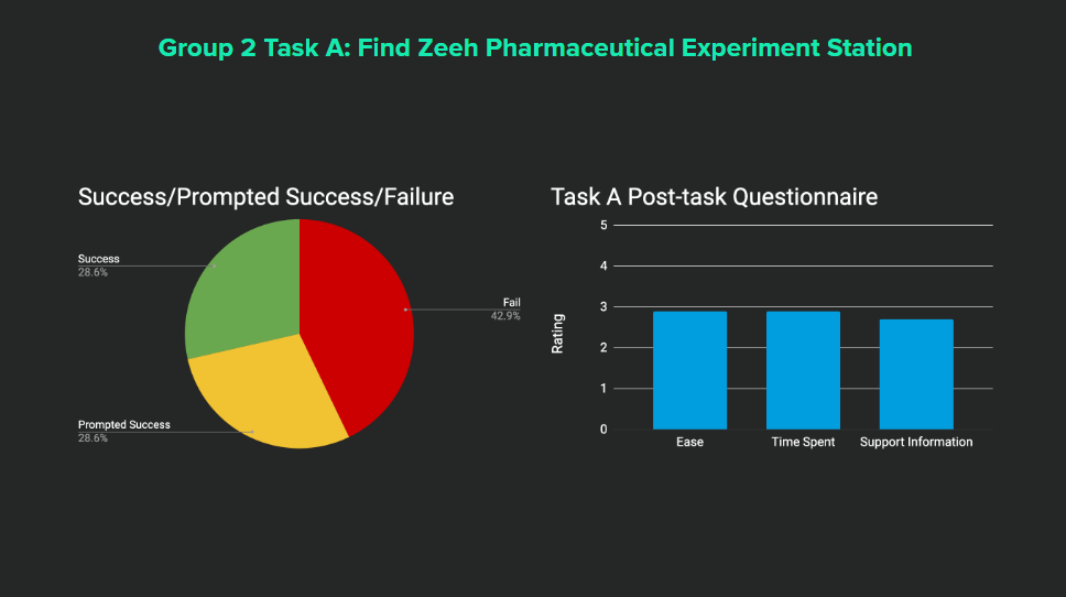
Usability Testing
Before development finalized, we ran moderated usability tests with two distinct user groups. Each session followed the same structure to allow cross-group comparison.
The confusion caused by the whole-page menu a significant finding. It was a design pattern the team had felt strongly about — but users consistently struggled to recognize it as a menu at all. Catching that early was significant.
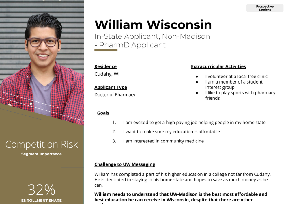
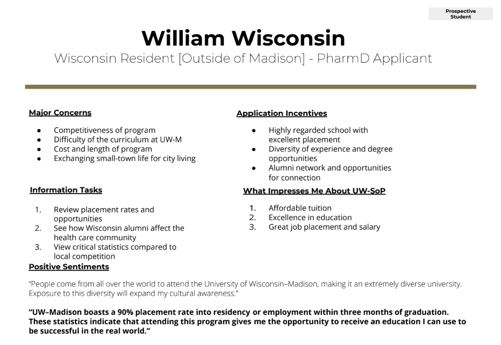
The persona-based login links revealed a related issue: the site used audience segmentation logic that felt intuitive to the design team but didn't map to how users thought about themselves. Users weren't sure which "persona" they were, so they weren't sure which link was theirs.
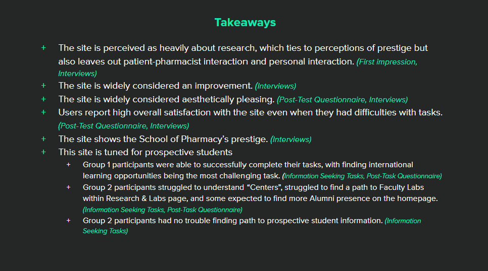
Post-Launch Evaluation
Research doesn't end at launch. Before the site went live, we developed a measurement framework for the client to carry forward — both quantitative and qualitative.
What I Learned
I learned a lot about stakeholder management and working with clients. We had a main stakeholder who was (rightly) willing to challenge all of our decisions so I had to show my work and back up my recommendations.<
I also learned about delivering news that others in my team might not want to hear. The lead designer was a highly artistic person with strong opinions and a desire to do things differently, but that didn't always match what the School of Pharmacy needed.
Finally, I learned about how card sorts can be an interesting exercise in building a shared vision for content and organization within the client as much as it is valuable user insight.