Overview
Most people only interact with the judicial system at the worst moments of their lives — a traffic violation, a divorce, a summons for jury duty. The last thing they need is a website that speaks in legalese and buries the information they need under layers of navigation designed for lawyers.
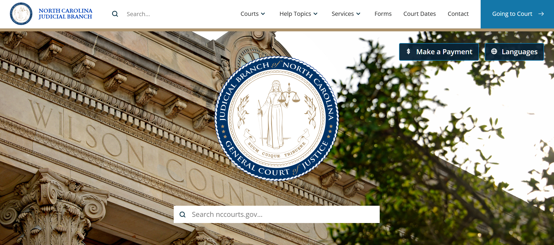
This project was a ground-up redesign of a US state's judicial branch website — covering the court system's public face across every county. The immediate driver was a CMS migration to Drupal. The real opportunity was bigger: unify a fragmented experience, modernize a system that hadn't kept pace with its users, and make the courthouse genuinely accessible to the people it serves.
The challenge was designing for two audiences with almost nothing in common — the general public navigating a stressful and unfamiliar system, and legal professionals who depend on the site daily and need fast, precise access to case data and court information.
My Role
User Interviews
Persona Development
Content Strategy
Card Sorting
Tree Testing
Information Architecture
Research Approach
The two-audience problem shaped everything. General public users and legal professionals navigate differently, tolerate different levels of complexity, and arrive with completely different mental models of how a court system works. Designing for one without the other means failing both.
- General public: Research focused on the highest-volume tasks — finding a case, understanding jury duty obligations, and accessing basic legal information.
- Legal professionals: The priority was speed and precision — they know what they need and resent having to hunt for it.
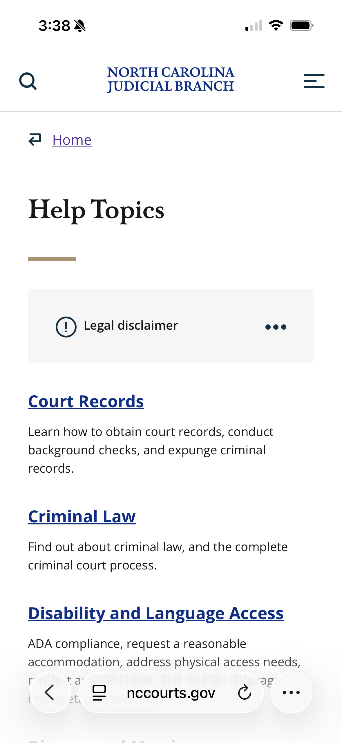
Gov.UK served as a north star for the plain language legal information section. The principle was simple: legal information shouldn't require a law degree to understand. Topics like divorce, traffic violations, and small claims court were rewritten from scratch with plain language as the design constraint, not an afterthought.
Key Findings
01
The public and legal audiences needed fundamentally different entry points. General public users arrived with task-first mental models ("I need to find my court date") while legal professionals navigated by document type and case number. A single navigation structure couldn't serve both — persona-based pathways were essential from the homepage down.
02
Legal jargon was the primary barrier for public users. Legal knowledge and jargon are a barrier to accessing the legal system. Plain language was the difference between a user finding what they needed and giving up to call the courthouse. Content and site organization must not require users to understand how courts are structured.
03
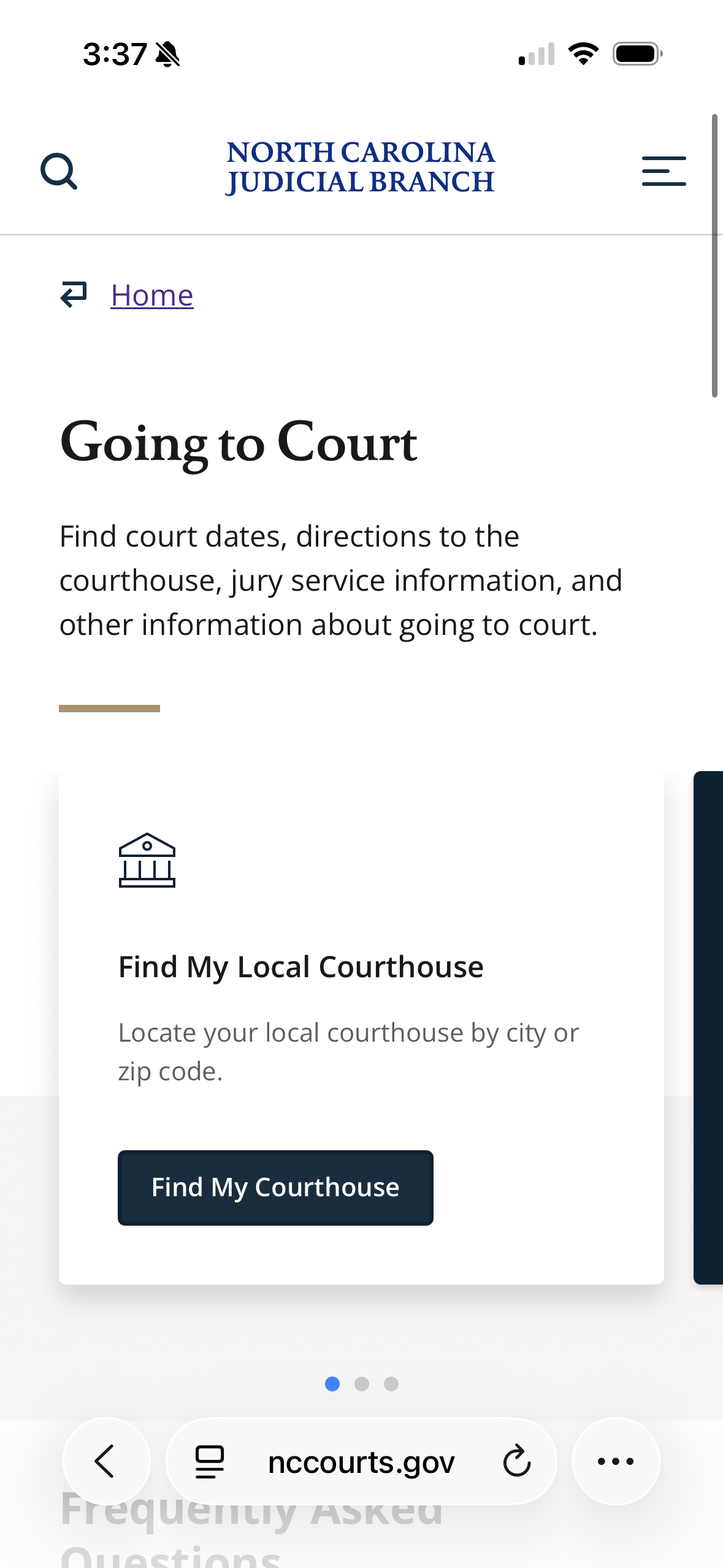
High-volume tasks were buried. The most common reasons people visit a court website — jury duty, case lookup, paying a fine — were not prominently surfaced. They required users to already know the right terminology to find them. Restructuring around task frequency rather than organizational hierarchy had an immediate impact on findability.
Impact & Outcomes
01
High-volume public tasks — court dates, jury duty, case lookup — were surfaced and prioritized at the homepage level, reducing the steps between arrival and completion
02
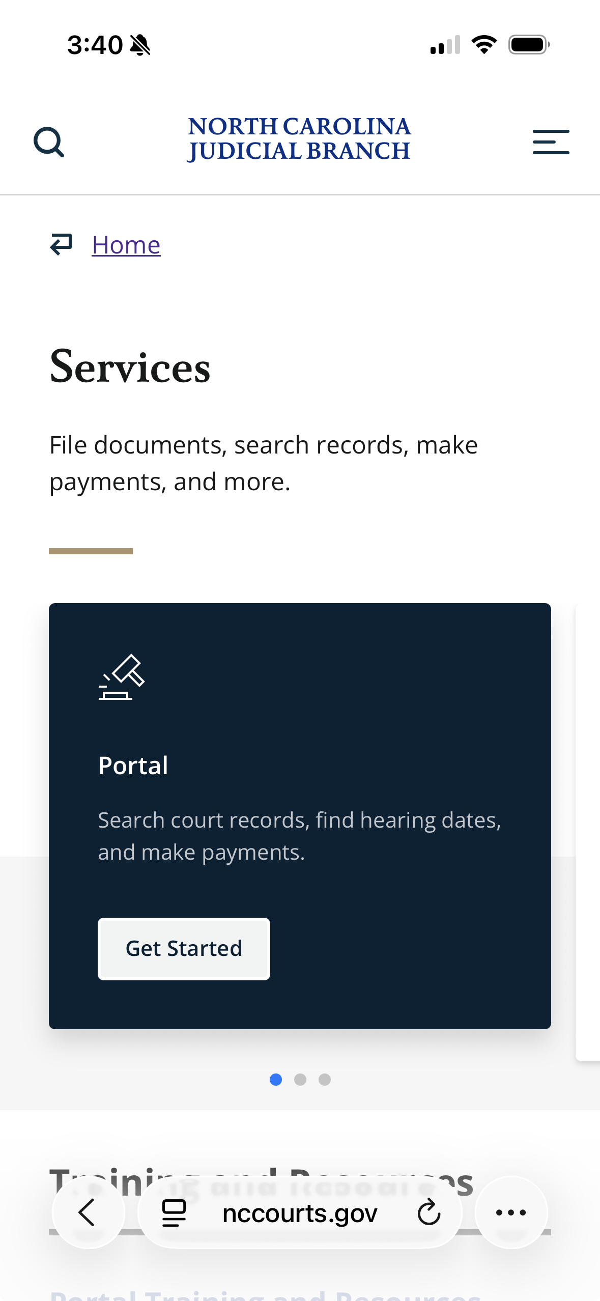
Digital services were promoted throughout the site to shift routine transactions — filings, payments, scheduling — away from in-person and phone channels
03
Plain language legal help launched for the court system's most common topics — finding court records, understanding the court process, divorce, and more — written for people, not lawyers
What I Learned
This was my first real exposure to a large organization with high-ranking stakeholders and genuine public stakes. It taught me a lot.
- Stakeholders - in this case court staff - might have low UX maturity and not understand what UXers do, but they do care about the public outcomes. Framing IA and content strategy around what the public actually needs made the collaboration fruitful.
- I learned how to conduct stakeholder interviews with sometimes intimidating stakeholders and synthesize their views into a coherent vision with achievable goals.
- Large content projects require a lot of skills to keep up with the tech and design changes that are being proposed in the team. It's easy for others to overlook the importance of content but it will be a roadblock if it isn't handled proactively.